Tableau extension ‘Add-on Charts’ allows you to add additional charts to your dashboard that are not displayed on the standard Tableau “Show me” section.
- Boundaries (line)
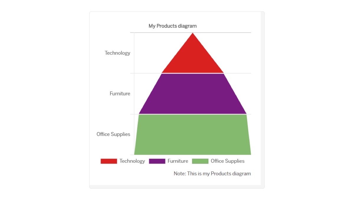
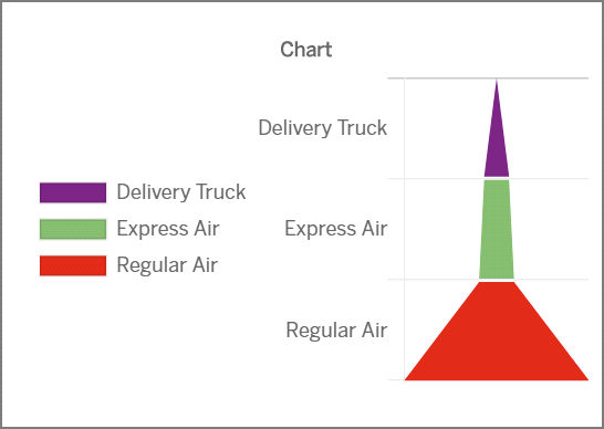
- Pyramid Chart
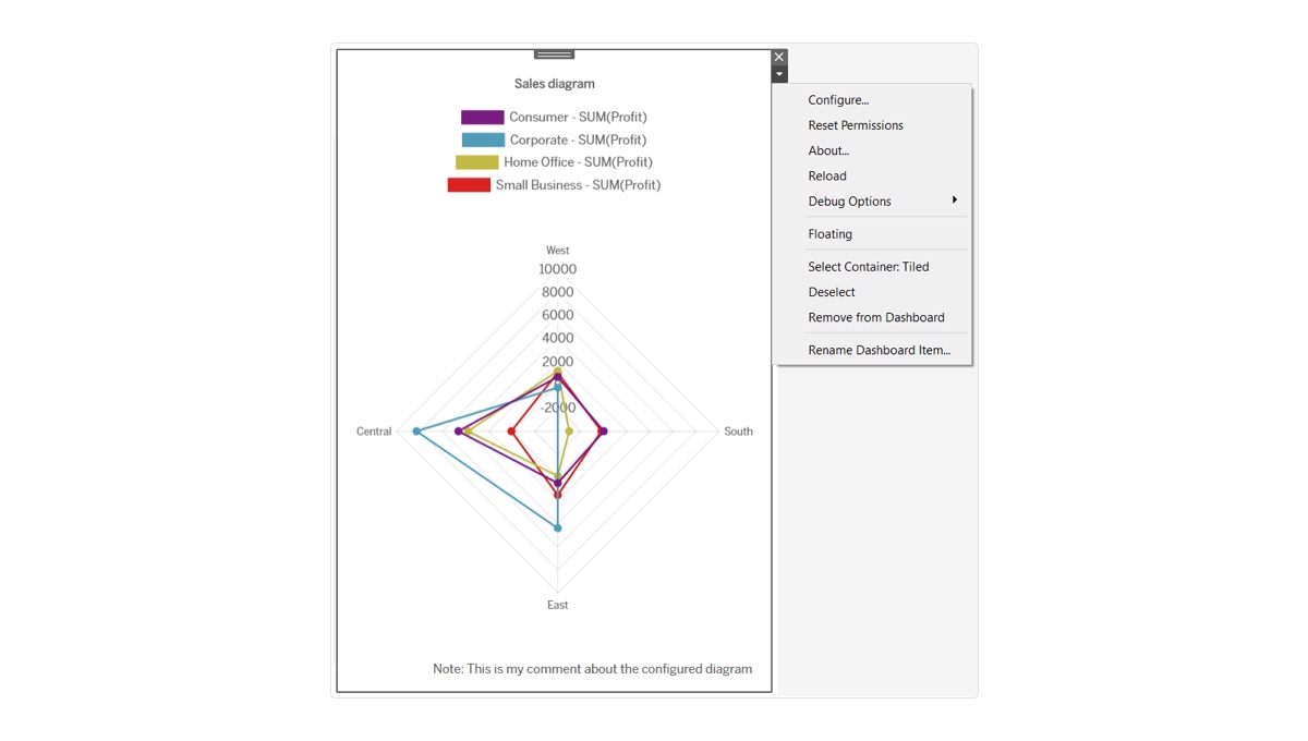
- Polar area
- Doughnut chart
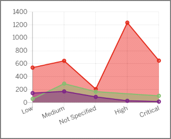
Graphs and charts help to draw the attention. Add them to your toolbar and get a deep, fact-based visualization. A graphical display of information helps to get out a necessary message, support the conclusion or emphasize the focus.
Steps you must take before starting work with extension
-
Open dashboard.
-
Drag at least one sheet with data you are going to visualize to dashboard
Guide to using extension
-
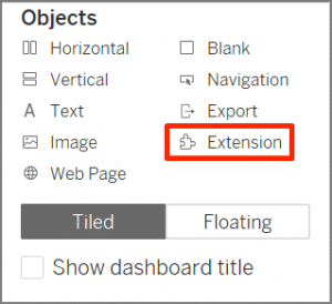
Make double click on Extension at the bottom of left-side panel.
-
In the appeared window click Extension Gallery and find extension in the Gallery. Download this extension to your computer.
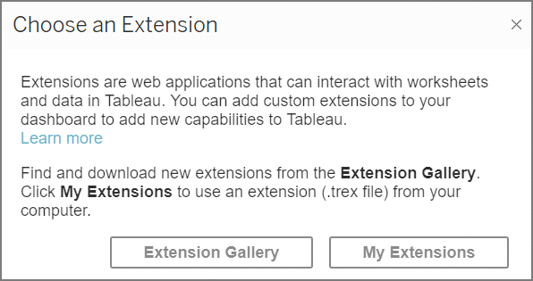
Select Extension Gallery only if you use the extension for the first time. Further always click My Extension in the window.
-
Click My Extensions. Browse to a folder on your computer where the extension is stored and select it by double click for importing to Tableau.
-
In the appeared window click OK to enable using extension.
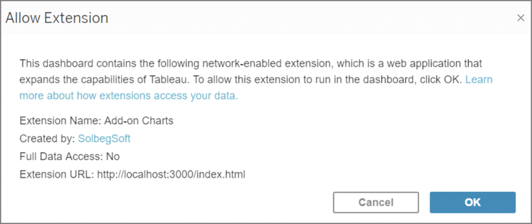
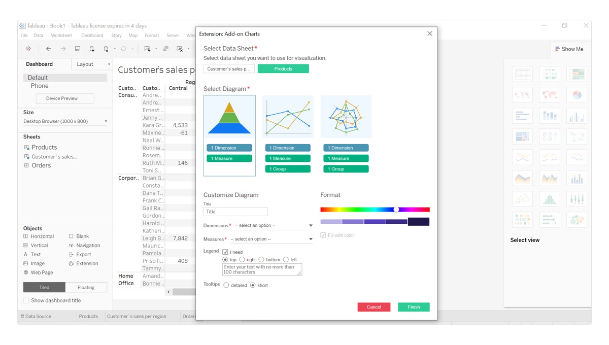
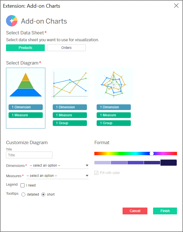
If adding extension on the previous step was successful, Extension: Add-on Charts page opens. Start filling out the form to configure data for visualization.
Fields that are marked with an asterisk (*) are required fields for filling out.
-
Select sheet with data you want to process.
The extension page identifies only those sheets that are currently dragged to dashboard.
-
Select diagram template you want to use for visualizing data.
Section Customize Diagram becomes enabled only upon selecting diagram type.
-
Enter name of your diagram in Title field.
-
In Dimensions and Measures dropdowns select values you want to include into your chart.
Dimensions and Measures fields display parameters from the sheet selected at the top of the extension page. Therefore, changing the selected sheet will adjust values in dropdowns.
-
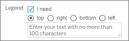
To add to your diagram an element explaining data you want to use in a chart, mark Legend checkbox.
You can also amend position of legend with respect to your diagram and add a note to data visualization.
-
Circles in Format section represent objects of different colors on a diagram:
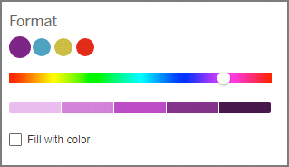
– Pick a circle to change its default color.
– Use color picker to amend color of the selected circle.
– Click hue slider to amend shade of the selected color.
– To fill your diagram with colors and highlight objects on a chart, mark Fill with color checkbox.
Fill with color checkbox is active only for the 2d and 3d chart templates.
-
Select tooltip type to define a way how to display information about objects on a chart upon hovering the mouse cursor over them:
– short – shows information about a single object that is currently under the cursor.
– detailed – displays information about all objects placed near the mouse cursor.
-
Click Finish to apply added settings.
As a result, the diagram is automatically created on the dashboard.
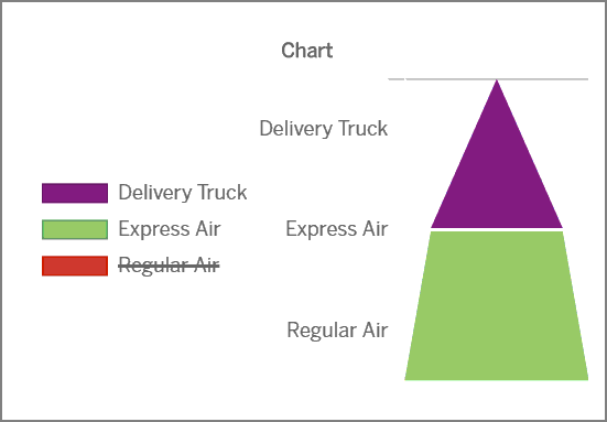
You can click the legend element to hide the selected value on the configured chart. The second click on the element returns the value back.
Deleting sheet used for data visualization from dashboard will crash the configured chart.
Make changes to an already configured diagram
To edit the created chart:
-
Click the configured diagram on the dashboard to select it.
-
In the appeared menu at the top right corner click => Configure…
-
Edit settings details and click Finish to apply changes.
-
Verify that the configured chart is updated.
If you want to create one more configured chart for another sheet on the dashboard, add the extension again.
Recommendations for visualizing data
Correct visualization of your data will be an advantage for your business:
– Speed of decision-making. To make a conclusion is easier and faster when you look at the chart, where one of the columns and one of the interaction points are placed higher than others in comparison to scrolling several pages of statistic in Google Sheets or Excel.
– Large number of engaged audiences. Most people perceive and memorize visual information better.
– High involvement of users. Bright, colorful chart with clear data explanation will receive attention of bigger number of users.
– Better understanding of information. Ideally configured diagrams can be understood not only by technical specialist, analyst and data scientist, but also by marketing director or SEO, that will allow each employee to make independent decisions in their area of responsibility.
Rules for successful visualization
– While selecting parameters that you want to visualize in one diagram, make sure these parameters complement each other.
– Select right scope and scales.
– Always stick to principle of simplicity in designing diagrams. Remember, the simpler is a chart, the clearer is information that you want to share.
– Number of charts on a slide or dashboard should not be more than 3.
– Don`t be afraid to experiment. If you have atypical task, most likely, its decision will be unordinary as well.
– Extension doesn`t put any limits on quantity of metrics you can use. But pay attention, using a big number of parameters can result in uninformative and bulky visualization.